Stori card — Case Study
Gamification and rewards in a credit card
Mobile app
Gamification
Summary
· · ·
My role
- UX Researcher/UI Designer
- A short alliance between Stori and Ironhack
- Duration: 2 weeks
Tools
- Google Forms: Quantitative research
- Mural: MVP (Moscow diagram), Information Architecture, summarize qualitative research
- Sketch: Mid-Fi and Hi-Fi wireframes
· · ·
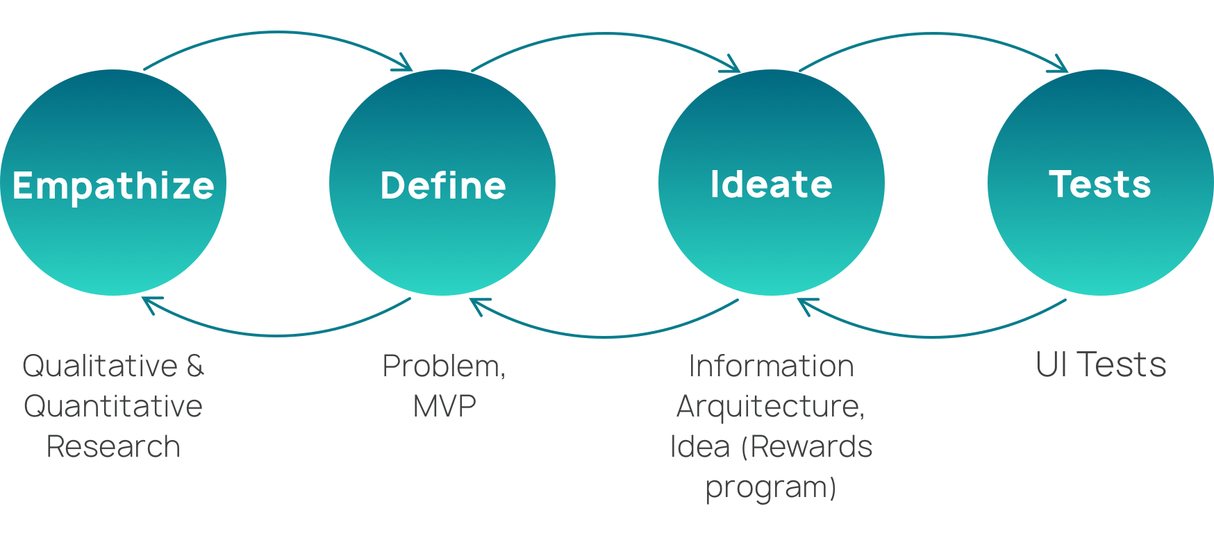
Process
· · ·
What is Stori?
Did you know that only 12% of the people in Mexico have a bank account? Stori is a credit card whose value proposition is focused on people who need to start their credit life and want to motivate their users to have a good financial education. This fintech started in January 2020.
To start all this process, I started with the qualitative research where I interviewed 8 people that have/had at least one credit card, 5 of them had debts issues with the credit card and the other 3 people are direct people that use Stori credit card (that I met through a Facebook group). For the quantitative process, I sent a survey through some Facebook groups of people that have the credit card, also these groups helped to look for some of the issues that had been happening in the app such as, not updating on time the payments.
](https://cdn-images-1.medium.com/max/5120/1*yGilmxRwgQH2fuBed01qqA.png)
At the beginning, it was difficult to find people to interview that had the Stori credit card because the card is very new, and the bank couldn’t give me that data, so I decided to add an option in the survey were people that wanted to be interviewed gave me their email to contact them.
· · ·
Important insights
The most common pattern found in people that had debts with the credit card, is that they said that the main cause of that issue was that they did impulsive shopping or unconscious shopping, also they thought that the card was an extra income and spent more than what can pay with their salary. Other important insights found are:
- 66,66% of the people that were interviewed said that they do follow up on their expenses by instinct and they know an average of it
- Some of the users, in the credit card groups in Facebook, expressed that they didn’t last much using the Stori credit card because it has the highest interest rate in the market and also because it doesn’t have any big benefits, only cashback and gain points with the national bureau for a future loan.
- 63% of the people that answered the survey said that improving their score in the national bureau of credit motivates them.
 on Unsplash](https://cdn-images-1.medium.com/max/6438/1*l0EBFYNCeM8b5v6QxMvNgw.jpeg)
· · ·
Main problem
Based on these results, I asked how might we help the user to…
- know if the credit card management is correct?
- use the credit card in a conscious way?
- have a reward because of their good credit card management?
I know that the project is successful if the average time with the card gets longer and the percentage of users retiring from the card gets lesser.
· · ·
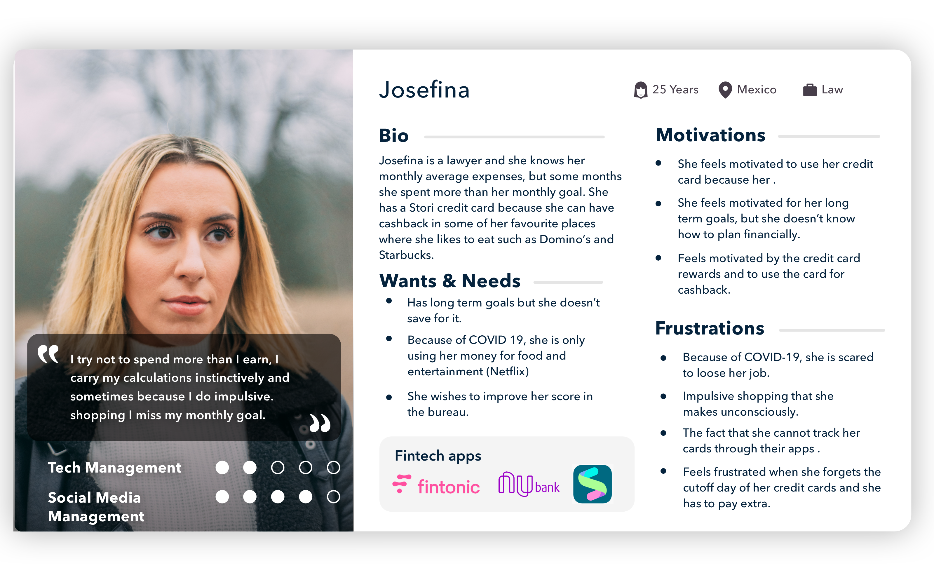
Our User
· · ·
What’s the solution for Josefina?
Based on these three main HMW questions, I did a brainstorming with all the possible solutions that can help to achieve the main goal and also would help the user to have a better experience, after doing the brainstorm I used the Moscow diagram and the Value vs. Effort diagram which helped me to select the MVP, which at the end was a rewards program divided into three main stages, that I’m gonna show you in this article:
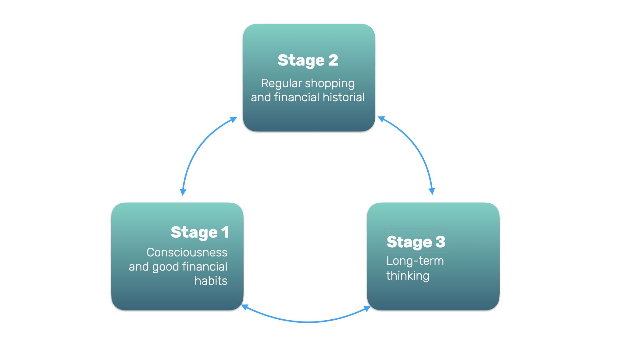
These rewards system was designed based on the gamification principles of Yu-Kai Chou called Development and Accomplishment, which helps the user to motivate their internal drive to gain new skills, overcome challenges and a sense to make progress through things like challenges to get badges, progress bar, fixed action rewards, and status points.
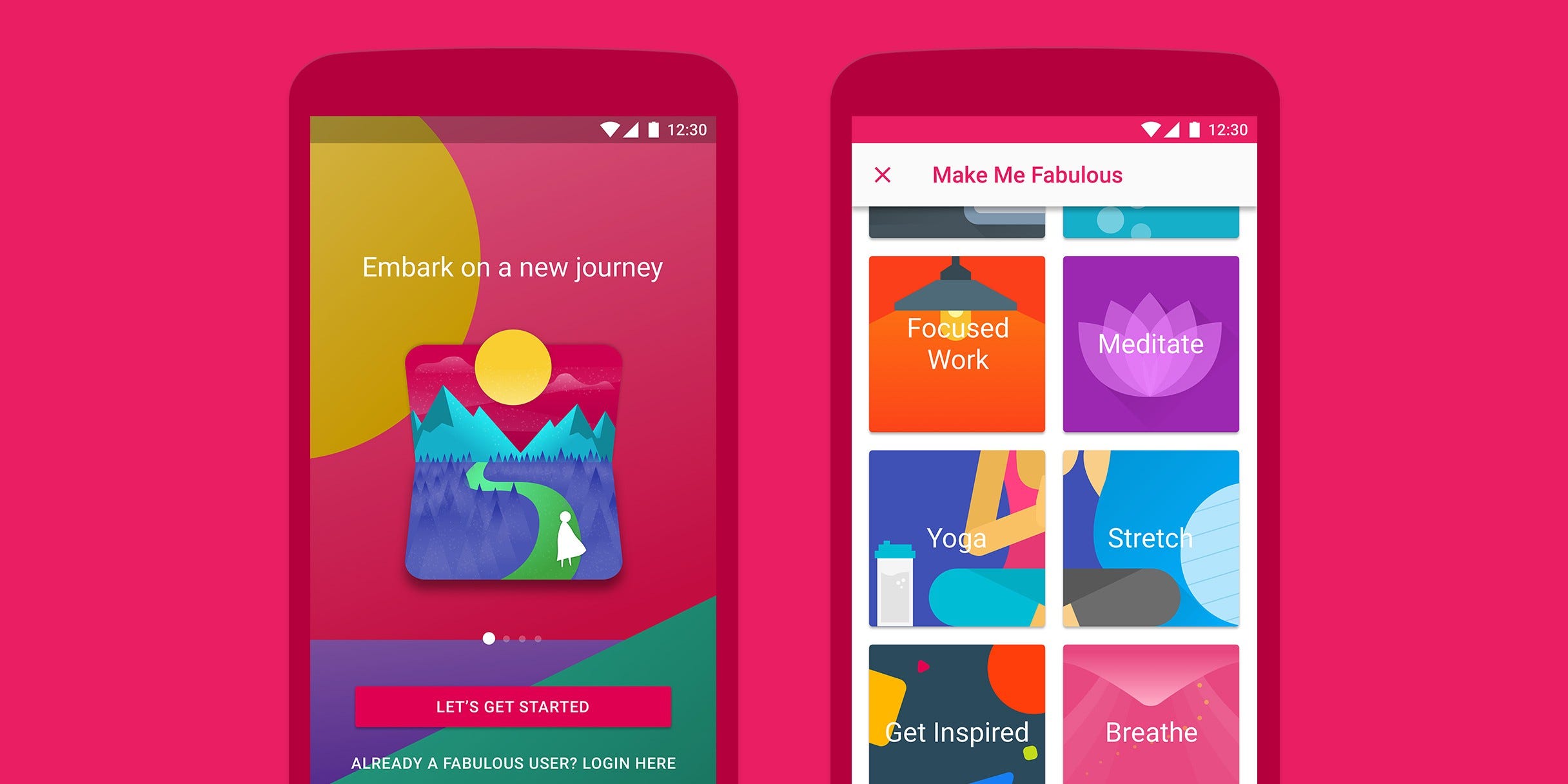
Also based on some of the interviews, I realized that some of the people that had big debts before didn’t have good financial habits such as make a constant follow up of the expenses and that’s why they used to be surprised by the debt at the end of the month. That’s the reason why in the first stage, there are more missions in which the user can create consciousness of their expenses, make constant follow up and can learn that they don’t need to use more than the 10% of their incomes with the credit card. To design these healthy routines I was based on the mobile app, designed by Duke University, called “Fabulous”, which incentivizes the users to repeat 3 times straight healthy actions and also based on the level the user receives articles for motivation (which can be a future option for Stori too).
1. Stage 1 — Bronce:
- 1. The main objective of this stage is to help the user to create consciousness and good financial habits.
- 2. Minimum expected duration: 2 months.
- 3. Benefits:
- Cashback with some selected brands
- Personalize the limits of the monthly expenses with the credit card: The main objective is to teach the user to limit the expenses until their 10% of their monthly incomes, they can use more but the app will notify them when they do it.
- 4. How to get points: Get 1 point per Mexican peso.
- 5. Missions:
- Confirmation of receiving the physical credit card.
- Limit the monthly expenses.
- Check the percentage of expenses per category and confirm.
- Establish the reminders of the payments.
- Answer the next questions 2 days before the payday, example: Which is the category where you spend most this month?
- Buy three times with the Stori card - 3 days straight.
- Check today your cutoff day — 5 days before.
- I didn’t spend more than the monthly limit set at the beginning of the month.
- Pay 2 months straight.
- Watch daily expenses — 3 days in a row.
- Watch weekly expenses — 3 weeks in a row.
- 6. How to get to the next stage:
- Achieves X points. The x points will be 10% of the user’s salary in 2 months.
- Achieves all the missions.
· · ·
2. Stage 2 — Silver:

- 1. The main objective to motivate the user to use the card for regular shopping (especially for small payments such as for coffee or food) and to create a financial history through this.
- 2. Minimum expected duration: 3 months.
- 3. Benefits:
- Stori Silver digital card.
- Fast pass for customer support.
- 4. How to get points:
- Get 1 point per Mexican peso.
- Get 5 points per each buy done in selected allies. (Starbuck, Dominos pizza).
- Get 10 points for each buy on a supermarket, coffee, or pharmacies.
- Get 20 points for each payment in digital platforms such as Netflix, Spotify, Amazon Prime, etc.
- 5. Missions:
- Buy coffee/food with the Stori credit card — 3 days in a row.
- Buy coffee/food with the Stori credit card — 3 weeks in a row.
- Buy in any supermarket with the Stori credit card — 3 weeks during a month.
- Buy with any of the sponsor brands that have cashback (this kind of strategy can work for Stori to get more sponsors because it can show that the card is promoting their. brand and their user to buy there and can work as a B2B strategy)
- Pay the total of the debt for 3 months straight.
- 6. How to get to the next stage:
- Achieves X points. The x points will be 10% of the user’s salary in 3 months.
- Achieves all the missions.
· · ·
3. Stage 3 — Gold:

- 1. The main objective: help the user to have long-term thinking with the credit card.
- 2. Minimum expected duration: 3 months.
- 3. Benefits:
- Stori Gold digital card.
- Tool for a project the financial goals in the long term: Using a linear regression with the user’s past data, and with the new model to reduce the interest rate that Stori is designing, also it’s important because this will help the user to design a long term plan with the. credit card.
- Less interest rate.
- Bigger amount limit for the credit card.
- 4. How to get points:
- Same way as in the silver stage.
- 5. Missions:
- Uses the tool for a project the financial goals in the long term.
- Stablishes a maximum goal of expenses to achieve the long term goal (buying a computer or a bigger credit limit of their current card).
- Pays 3 months straight the full amount without taxes of the monthly debt.
- Accomplishes all the goals and becomes the Stori Leader.
- 6. How to get to the next stage:
- Achieves X points. The x points will be 10% of the user’s salary in 3 months.
- Achieves all the missions.
- 7. Restrictions:
- If the person doesn’t pay the debt for 2 months, he/she will go back to the first level.
The user must accomplish all the minimum points and the missions in 3 months, by doing all these the user will receive:
· · ·
Wireframes:
To begin with the wireframe process, I did these sketches that also helped me to do the user flow that my user would have to do only for watching the points and the current status in the level.

After testing the low-fi prototype, the most important of the changes with the flow and were:
- Adding an introduction to the user: A pop-up that shows the first time that opens the app and the card is confirmed.
- Changing the structure that shows the advance in points and there’s also an indicator that shows the missions accomplished.
- Deleted the benefits in the score view because the user can see it in the level information tab.
- Changed the level information pop-up to a whole view, so it will be easier to read for the user.
- Changed the layout for missions: It doesn’t show information, only the badge that the user gained and the instruction of the missions is in another view.
This is the Mid-Fi prototype with all the changes and improvements that were found in the stage before.

Because of time restrictions, couldn’t have much time for tests, with the few tests done, these are some of the changes:
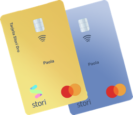
- Add how the cards would look when the user gets the silver or the gold level.
- A notification which shows that the user is on a new level.
For the high definition prototype, I used the same color palette in the current mobile app, the only new things were the gradients used for the credit cards:
This is the flow summarized of all the rewards system, which will show only the flow to check the points and notify the new level:

Check the interactive prototype here.
· · ·
Next Steps
These are some features that I recommend the app should have so this whole experience of the rewards can be the best:
- Create a calendar so the user can check how much spent per day.
- Lead nurturing of messages with motivating messages such as, “remember you are close to becoming a silver client and you are just one mission away to achieve it” or “Remember that you only need 2 months straight of payment of your credit card so you can achieve the On-Fire batch”. In that way, the user can remember to check the app for those routines.
- Functionality so the user can personalize the dates that want a reminder of his/her payments, in that way the person can choose the best time that suits better.
- Tool for a project the financial goals in the long term: Using a linear regression with the past data of the user, and with the new model to reduce the interest rate that Stori is designing.
- A thermometer to show people how much their score in the bureau is improving or not with the user's financial behavior.
· · ·
Conclusion
In the end, because of the time, I couldn’t test all the missions created with real users, but I know that it would have been good to understand if those missions really create a good financial habit and if these missions would help to motivate users to stay longer with the card.
This project won as the best project of the 35th generation of UX/UI Bootcamp in Ironhack Mexico City.
If you want to create awesome things with tech and know about my projects contact me through LinkedIn
